Before you can work on any digital user interface, whether a web site, tablet reader, or mobile property, you need to ask questions about audience and purpose. Who is my audience? How many distinct types of users are in that audience? What are the business or organizational goals—how will success be measured?
I usually prefer to start with business and organizational goals before focusing on who the audience is. This goes a bit against the grain of human-centered design, and in fact in my consulting I specifically refer to goal-centered design as an effective corporate strategy. But the phrase “audience and purpose” is so ingrained from the days of college composition that I’ll go with tradition and begin with who before what.
Audience Analysis
In his book The Elements of Audience Analysis Jan Youga wrote: “the reader is an ever-present part of the composing process—as significant as the person doing the writing, the message being conveyed, and the person doing the writing.” This principle extends to the user interface of the tablet reader: the user is an essential part of the design.
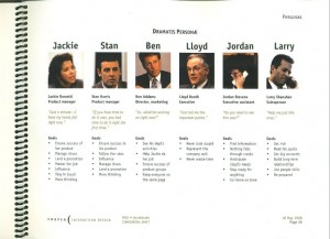
What is your user demographic? Do you have several user archetypes, or personas? (Personae if you are a Latin scholar, but I could never get anyone to spell it this way.) In User Experience Design (UXD) circles, personas are a more or less codified way to formally construct profiles of distinct types of users in terms of their relevant habits, rather than just viewing your broader readership lumped into one homogenous demographic.
Every major publication maintains demographic data, typically published in the media kit, as in this one for Esquire.
Personas go a bit farther in that they help you understand what your different demographic segments like and are like.
I was introduced to personas as a UI design stratagem by the folks at Cooper Interactive in 1998. (Alan Cooper is known as the “Father of Visual Basic” and is the author of About Face: The Essentials of User Interface Design.) There is a bit of an art to persona development; it can tell you a lot about your audiences’ habits and technology adoption rates, their tolerances (or hunger for) interactivity, and how they like to read.
Audience analysis gets to the heart of these types of questions:
- What types of users do you have?
– levels of experience
– interests and information needs
– tasks they wish to perform
– how they want to use your information - What information will they need?
- What signposts do they expect?
- What metaphors do they use?
- What terminology do they use?
- What do they use the information for?
Personas can give you insights into whether certain features will work for all users, or whether some features should be self-selecting (or omitted, or introduced slowly, or appear only in certain topics). For example, a sports nut may want embedded video of game highlights, whereas someone interested in politics might care less about a video of politico talking heads.
Incidentally, stereotyping is acceptable in audience analysis! For food & drink, you might develop very different male and female personas. Women might like to see recipes; but what interests different demographics of men? (I can tell you that my Dad, whose cooking has improved from years of being a widower, loves watching the women of Food Television.)
A tablet interface needs to start with basic principles of UI design (as they relate to the demographic of tablet readers). Innovation often means departing from the standards, but you have to start with the standards and make good educated choices about when to leave the reservation.
Purpose
Behind every tablet app is a company or organization with goals. Do you want to sell the app itself? Do you need to drive ad revenue? Will you host both free and premium paid content?
If your goal is to sell advertising, then you are primarily concerned with ad impressions. This means you want to promote as many different articles as possible, enticing users to stay in the app until blood forms on their index fingers. You’ll need lots of “see related” links and slideshows and surveys and other irresistibly clicky objects.
If your goal is to sell the reader app itself, or sell subscriptions, then you need to provide content that users can’t get for free elsewhere, and of a sufficient quality (and/or quantity) that they perceive good value for money. Interactive charts, in-depth reports, and exclusive video makes for tempting paid fare. Searchable news archives might provide value along the quantity dimension.
Free content with enticements to purchase paid premium content, such as live event streaming or interactive participation, means having sufficient free inventory to keep users coming back, as well as sufficiently compelling paid content to meet revenue goals. You’ll also need a means for signing up members and for charging for content.
In summary, you need to think about your audience and your goals, the who and why of the tablet project, before you get down to wireframes (that’s UXD-speak for blueprints) and visual designs. But wait, there’s one more thing to consider before you sharpen those architect’s pencils: the form and description (metadata for my fellow geeks) of the content itself.
Next up: Content Analysis
